Food & Beverage · 2024
KYLA Hard Kombucha
A bold visual identity and a run of flavour-led out-of-home campaigns for a craft hard kombucha brand, built to stand out in a crowded, fast-growing category.
Brand & visual identityMarketing & communicationsMarketing collateral
The challenge
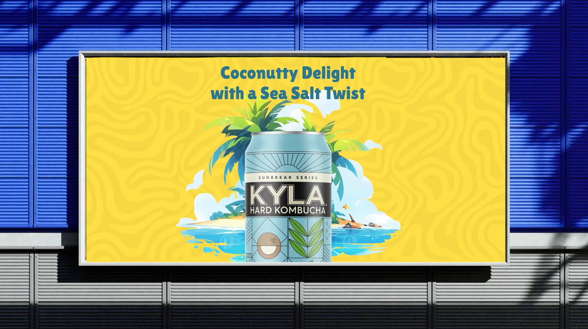
Hard kombucha is a booming category where most cans blur into one another on the shelf. KYLA had a genuinely health-forward product but no distinctive visual language to carry that story across packaging and out-of-home, and no campaign system to launch new flavours quickly.
Our approach
- A bold typographic system and geometric can architecture that reads instantly from a distance and holds together across the range.
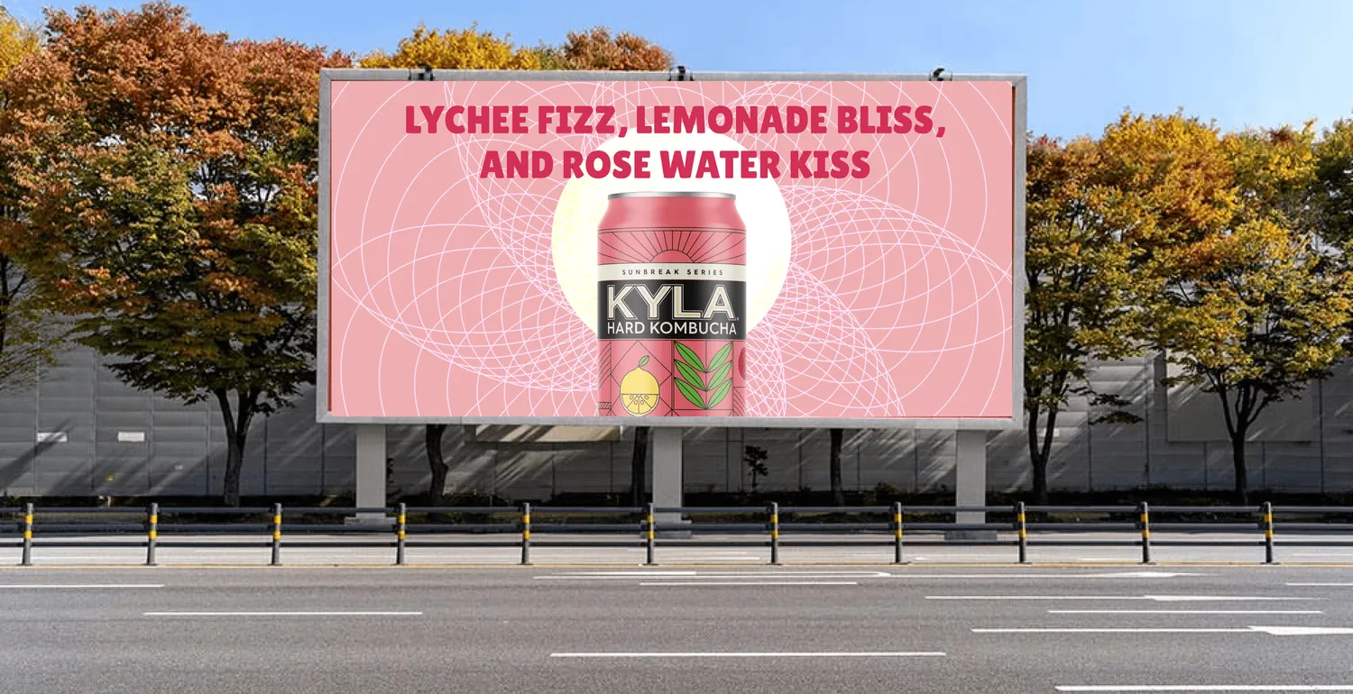
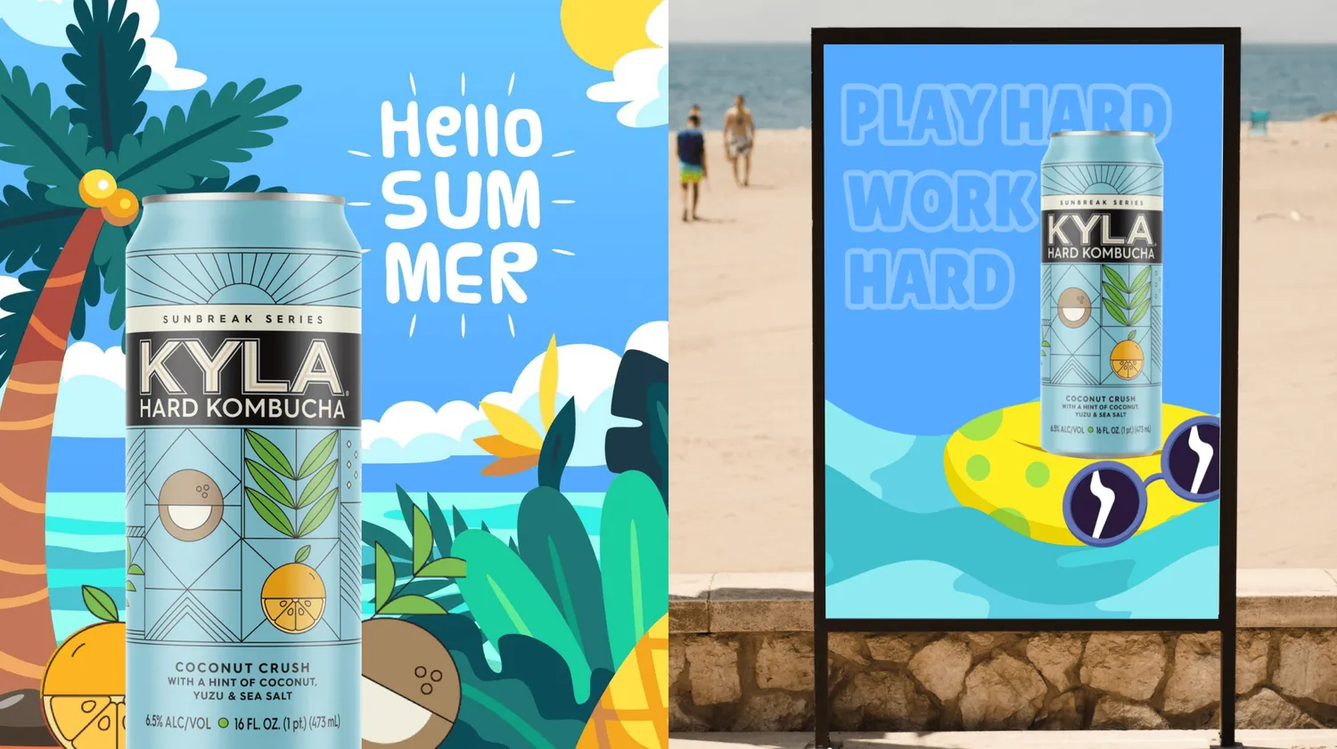
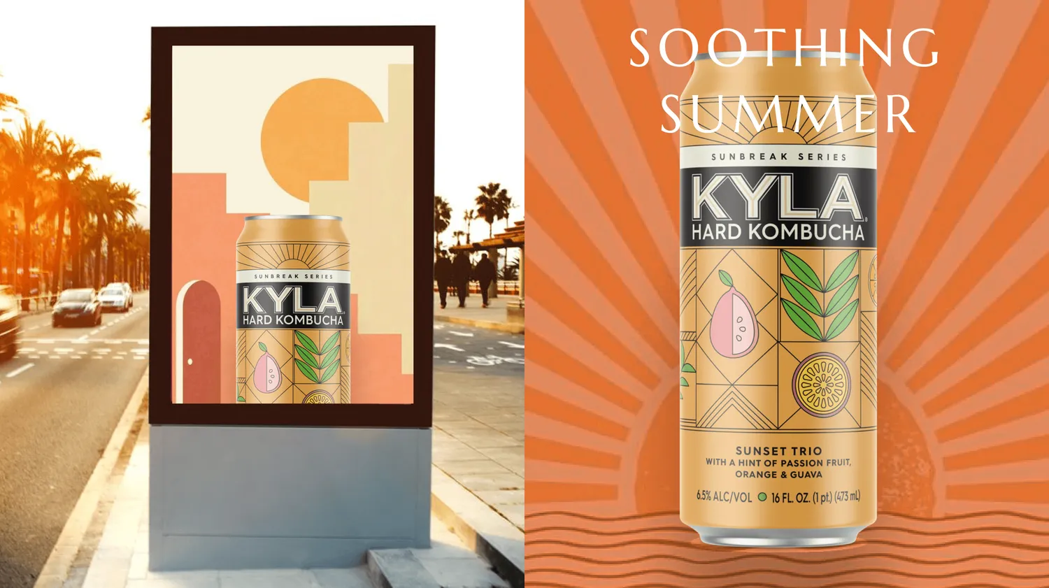
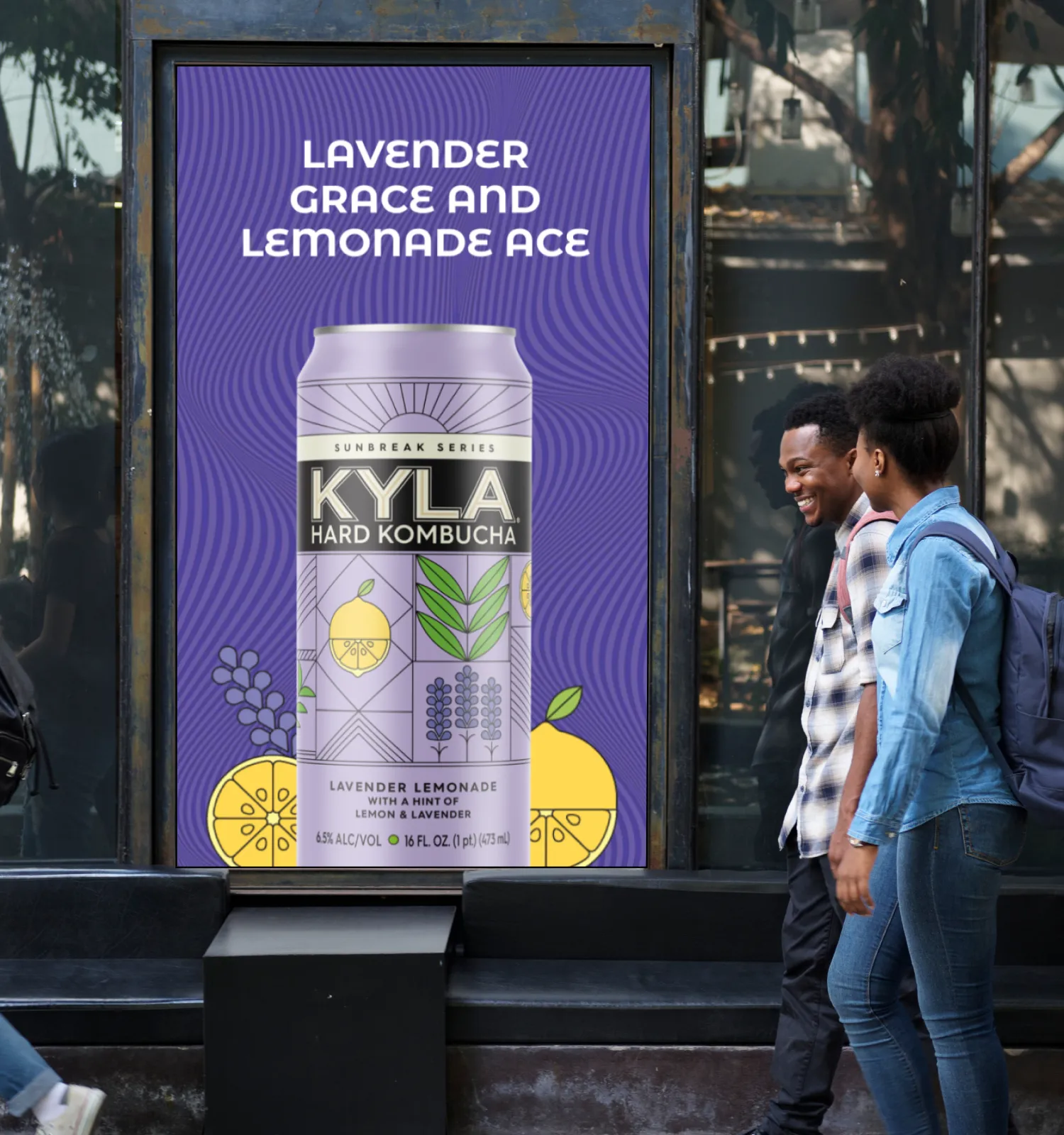
- A flavour-led colour world so every variant (Coconut Crush, Sunset Trio, Lychee, Lavender Lemonade) owns a distinct, recognisable identity.
- Dynamic out-of-home layouts and billboard creative that translate the identity into high-impact marketing collateral the team can reuse.
Selected work

See it live
The real site, live and in your browser. Scroll through it here, or open it in a new tab.
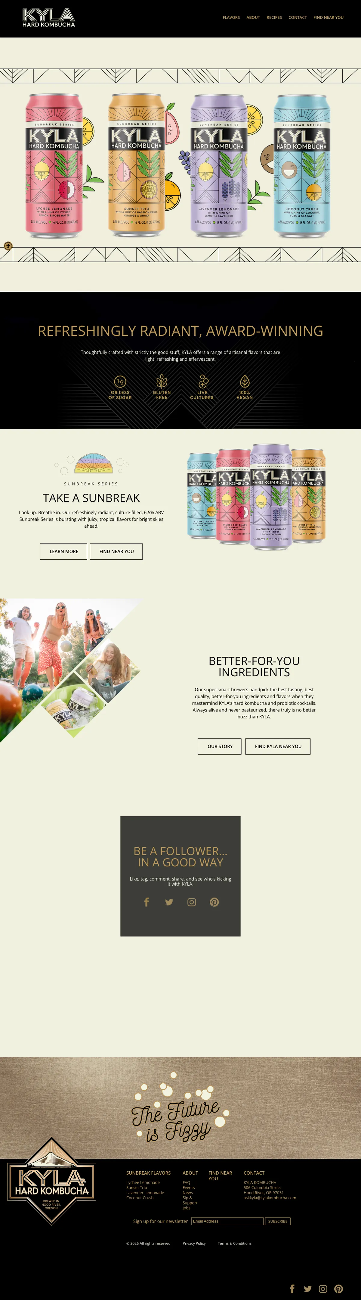
Scroll inside the window to explore the homepage
The outcome
A cohesive brand and campaign system that positions KYLA as a premium, health-conscious choice and gives the team a flexible kit for rolling out new flavours with a consistent, ownable look.